Custom Sock Colors & Patterns
Plan the color direction and pattern style for your custom socks, from simple solids and brand color combinations to stripes, color blocks, repeat patterns and seasonal artwork.
Plan Colors Before Production
Sock colors and patterns affect the first impression of the product. A clear plan helps avoid weak contrast, crowded artwork and unclear design details.
Color note: screen colors are for reference only. Final results depend on yarn, dyeing, printing method and sample approval.
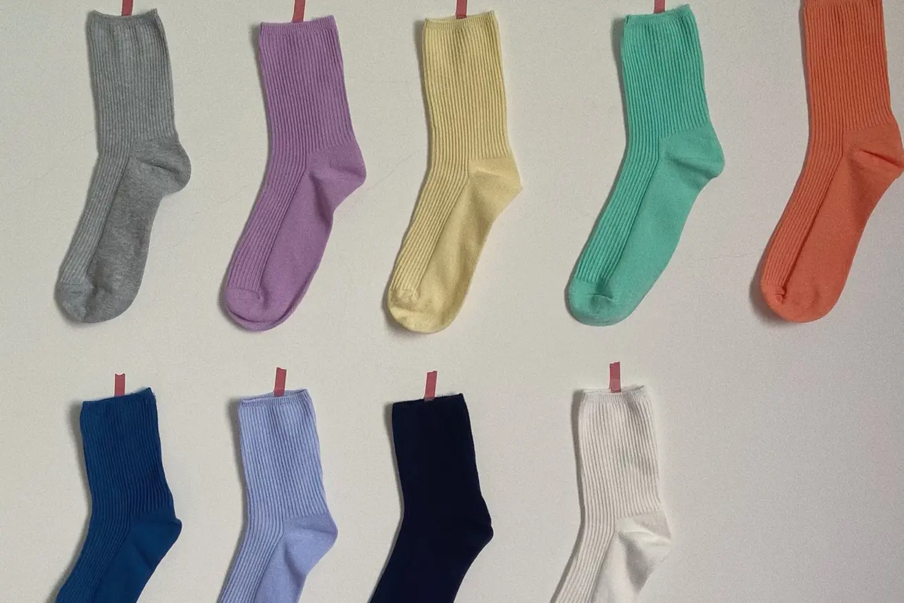
Solid Colors
A solid base keeps the sock clean and easy to understand. It works well for simple styles, uniforms and logo-focused designs.
- Clean base color
- Easy to review
- Good for logo designs
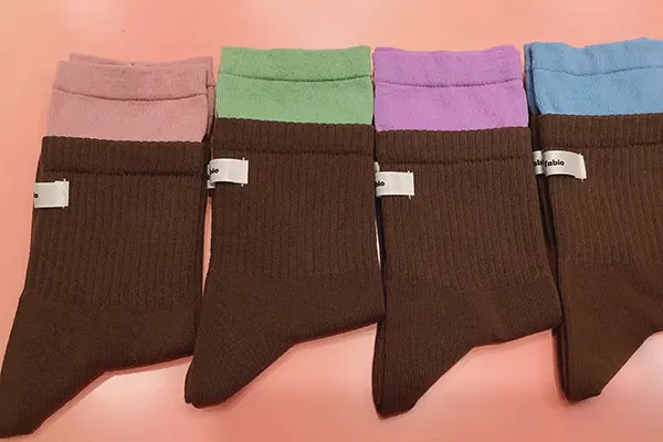
Two-Tone Colors
Two main colors create contrast without making the sock look too busy. This is a practical choice for brand or team color matching.
- Clear contrast
- Balanced look
- Easy color pairing
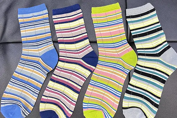
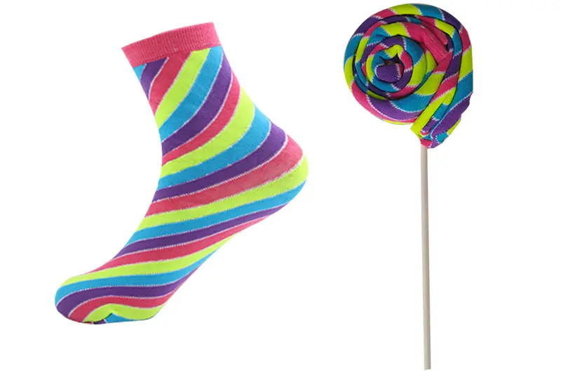
Stripe Patterns
Stripes are common for sports, school and casual socks. Width, spacing and color order can be adjusted before sampling.
- Classic sock style
- Flexible stripe width
- Clear color rhythm
Color Blocks
Color blocking separates the cuff, heel, toe, foot or leg into clear areas. It gives the sock a stronger and more structured look.
- Clear sections
- Strong layout
- Good for contrast areas
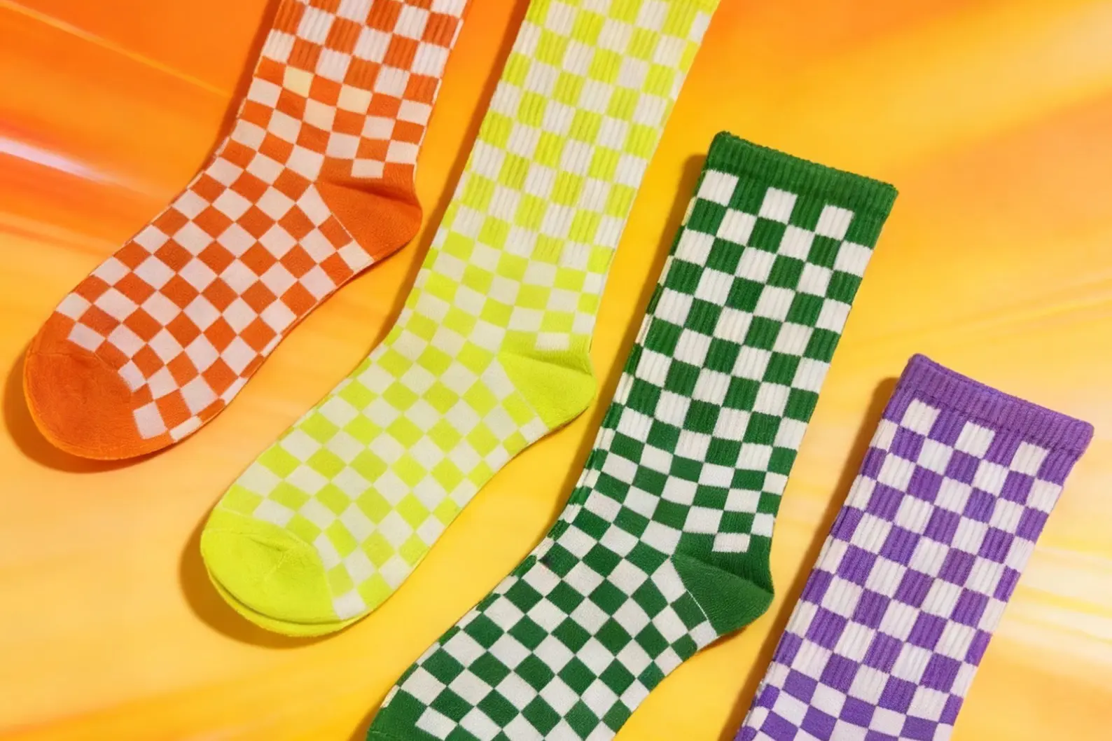
Geometric Patterns
Geometric patterns use lines, shapes and repeated forms. They work best when the layout has enough space and contrast.
- Modern style
- Shape-based design
- Needs clean spacing
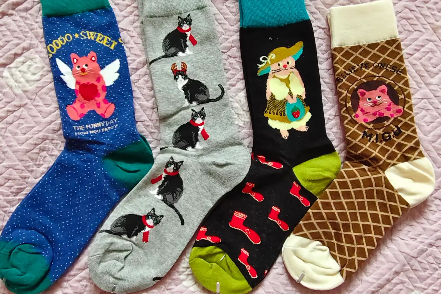
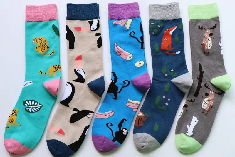
Repeat Patterns
Small graphics can be repeated across the sock for an all-over look. The key is to control size, spacing and contrast.
- All-over look
- Repeated graphics
- Spacing control
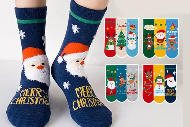
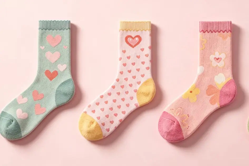
Seasonal Patterns
Seasonal socks often use holiday colors, icons or campaign elements. The design should still stay readable at sock size.
- Holiday themes
- Campaign colors
- Good for limited runs
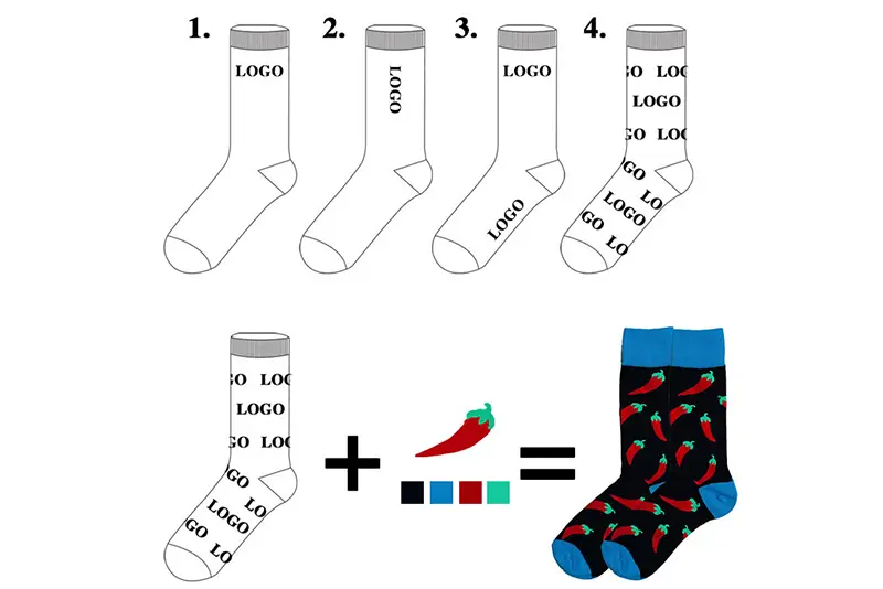
Brand Color References
Brand colors can be matched with Pantone numbers, brand files or approved samples. For important colors, a physical sample is recommended.
- Pantone reference
- Brand file support
- Sample review
What Makes a Sock Pattern Work
A sock pattern needs the right balance of contrast, size, spacing and color count, so the design stays clear after knitting and daily wear.
1. Clear Color Contrast
Good contrast helps logos, stripes and artwork stand out on the finished sock.
2. Practical Pattern Scale
Larger shapes usually read better than tiny details, especially on knitted socks.
3. Enough Layout Spacing
Proper spacing keeps repeat patterns clean instead of crowded.
4. Controlled Color Count
A focused color palette is easier to produce and easier for buyers to recognize.
Compare Sock Color and Pattern Options
Use this table to choose a color or pattern direction before preparing the final artwork.
| Option | Visual Style | Best For | Planning Notes |
|---|---|---|---|
| Solid Colors | Clean and simple | Minimal designs and easy color direction | Confirm color reference and sample result before bulk production. |
| Two-Tone Colors | Simple contrast | Brand color pairs and balanced designs | Use enough contrast so the two colors do not blend visually. |
| Stripes | Classic and rhythmic | Sporty, casual or retro-style socks | Confirm stripe width, spacing and color order clearly. |
| Color Blocks | Bold separated sections | Cuff, heel, toe, foot and leg color layouts | Color boundaries should be simple and easy to understand. |
| Geometric Patterns | Modern and shape-based | Lines, grids, diamonds, dots and abstract layouts | Avoid shapes that are too small or too close together. |
| Repeat Patterns | All-over pattern feel | Small icons, symbols and decorative graphics | Keep repeat size and spacing practical for the sock area. |
| Seasonal Patterns | Themed and campaign-ready | Holiday, event and limited collection designs | Use a controlled palette so themed artwork does not look too busy. |
| Brand Color References | Brand-focused | Projects that need color consistency | Pantone references, brand guides or physical samples are helpful. |
Color and Pattern Details Worth Confirming
Before production, color and pattern details should be clear enough for sampling. This helps reduce back-and-forth and makes the final sock easier to approve.
- ✓ Main color direction and secondary color direction
- ✓ Pantone, brand guideline or sample color references
- ✓ Pattern type, such as stripes, color blocks or repeats
- ✓ Pattern size, spacing and placement area
- ✓ Contrast between background and pattern colors
- ✓ Sample review for real color and pattern effect
Need Help Planning Sock Colors or Patterns?
Send your color references, pattern idea or design direction. We can help review whether the color contrast, spacing and pattern scale are practical for custom socks.
Custom Sock Colors & Patterns FAQ
Answers to common questions about sock colors, pattern planning, contrast and color references.